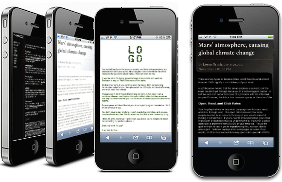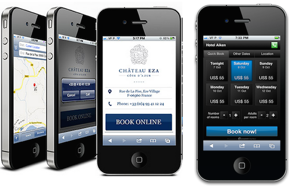
Marketing in today’s digital world means reaching and engaging busy people wherever they happen to be. And they are almost certain to be on a mobile device.
Mobile engagement and optimization has moved from being a trend in email design five years ago to being the new standard, making the requirement to optimize the mobile email customer experience more important than ever before.
Consider the following factors for a great mobile email customer experience …
Design for great mobile UX
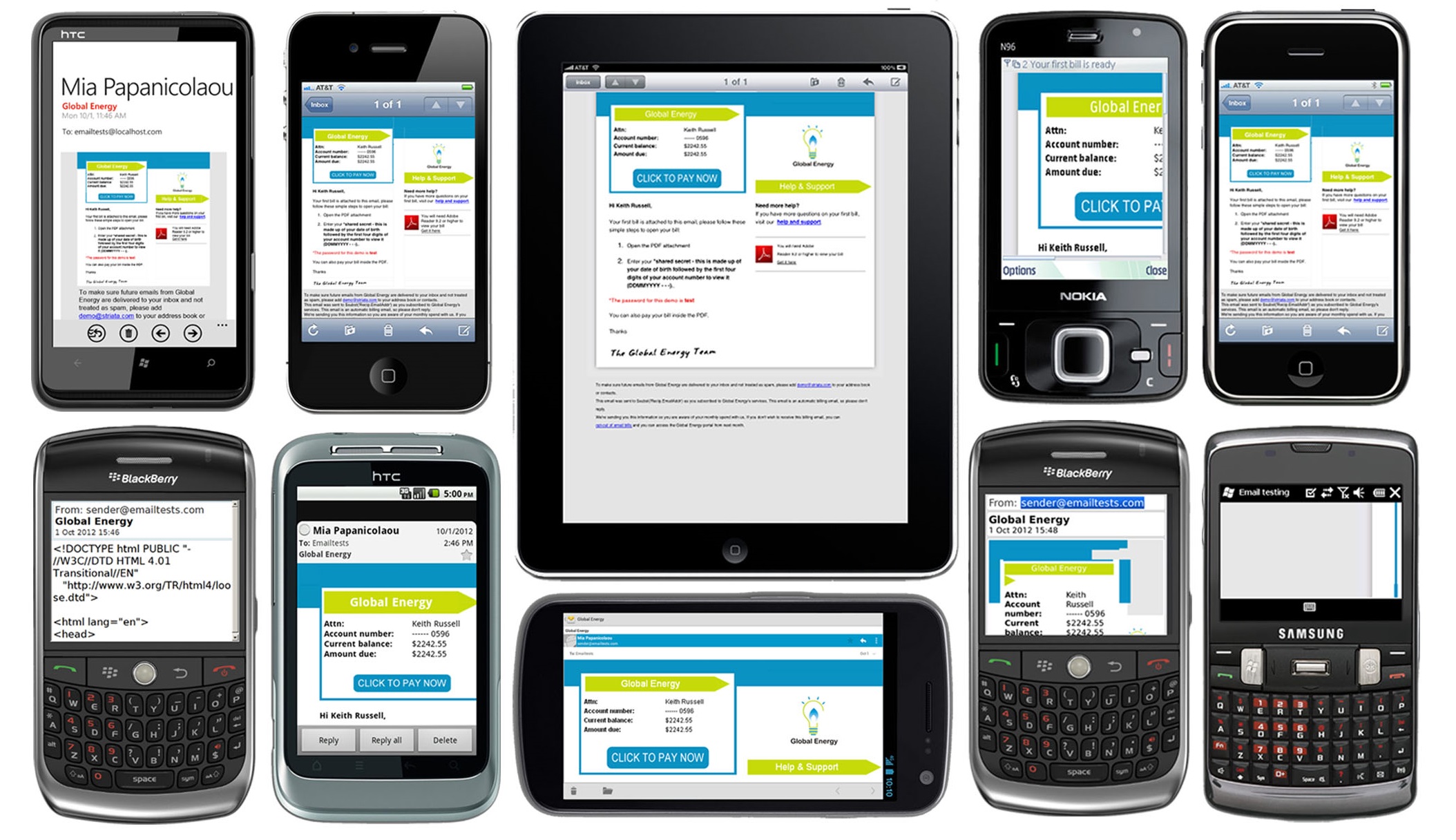
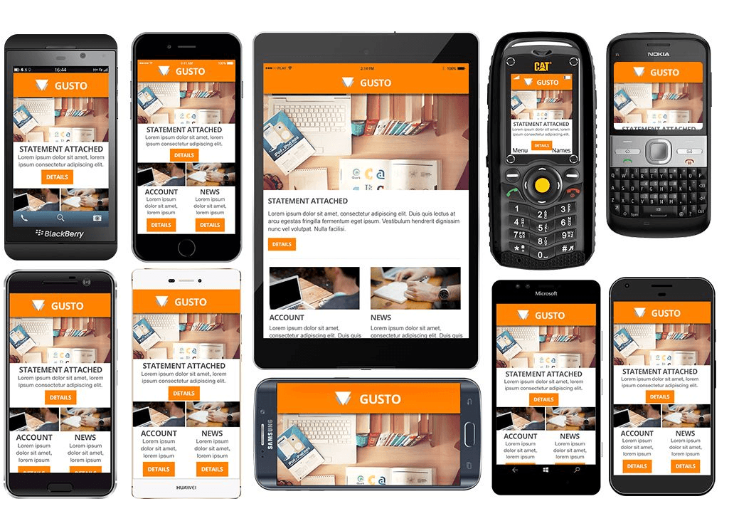
A mobile device has a small screen, which doesn’t lend itself to old school navigation. Whether you use responsive design, scalable design or a combination of both, you must make sure your email template can be viewed optimally on any device. Designing for touch navigation and ‘fat fingers’ requires a limited number of links that are well spaced.
Content that works for smartphones
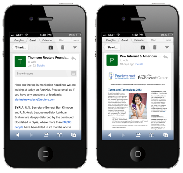
While email design has become more visual, designing for mobile, demands that images are used more strategically, yet sparingly. Download speed is related to the number and size of the images, so keep clutter to a minimum. Some devices are set to turn off the display of images by default so the use of ‘alt-text’ is vital. Avoid complicated diagrams, structures and forms, as these are not easily viewed on a smaller screen.
Have a message and call to action
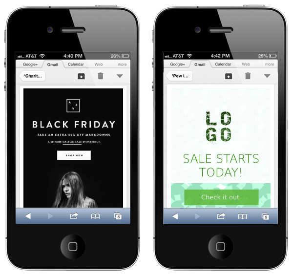
A mobile user won’t spend more than a few seconds scanning an email. You need to help them find what they are interested in quickly and effortlessly. Having a simple message and an obvious call to action will result in improved mobile engagement.
Research has shown that when an email does not display correctly on mobile, a large majority of recipients will simply delete it.
Know the right tactics for mobile optimization and you will be more successful in your email marketing efforts.


