


Depending on your industry and audience, somewhere between 40% and 70% of your emails are opened on a mobile device. A digital publishing report shows that email tops the list of activities on a smartphone. That’s right, smartphone owners are more likely to use their device for email than for phone calls.
The rise of mobile isn’t new. It’s been the next big thing for several years now. Yet, a lot of marketers aren’t making the most of mobile email, buying into myths about the market or are avoiding it altogether for fear of the time or costs involved. We’ve analyzed the data, polled clients, asked the experts and come up with a list of mobile marketing myths. Ready, set, debunk…
Myth #1: Mobile-optimized email is optional

Unfortunately, emails designed for a laptop or desktop screen don’t look so good on a palm-sized device. Furthermore, it’s possible that the majority of your email opens will occur on a mobile device this year and that as many as 80% of people delete emails if they don’t look good on their device (Litmus – Responsive Email 101). So, creating mobile-optimized emails is no longer an option. You want the optimal viewing experience on every platform and the best customer experience on mobile, as well as desktop environments.
Myth #2: Get Responsive and forget it
Customers and businesses alike are going mobile, so emails must go mobile too. But, it’s not as simple as switching to a responsive email template. Good responsive design ensures that your emails stretch and scale, so that all elements are readable, easily clickable and all images are visible. However, a responsive template doesn’t mean the job is done. Each email needs to be carefully managed, so you can get the best results. Consider active actions, such as removing links that get consistently low clicks, making buttons bigger or removing some images or ads. Remember, the first link in a responsive email on mobile has a 30% higher click rate than non-responsive design (Litmus). Read more in our blog post “Think Beyond Just Responsive Design for a Great Customer Experience.“
Myth #3: My mobile read rate doesn’t matter much

There is a lot of research about how many people own smartphones, read emails on a mobile device, etc. Industry averages are a good guide, but the most important statistic is your company’s mobile read rate. How many of your users are opening your email on a mobile device? That’s a vital statistic – and worth reviewing regularly, so that you can enhance your mobile email strategy based on readership.
Myth #4: I can’t track results for mobile users

For the most part, you can. Many smartphones use a mobile email client, such as MailDroid, Apple Mail or Gmail and open rates, click-throughs and the like, are trackable. Okay, you may not be able to measure opens for some Blackberry devices, but that’s a very small percentage (probably less than 1%) of your mobile email audience.
Myth #5: If I don’t have a mobile website, I don’t need a mobile email
In a perfect world, your email, website and social media are linked, mobile and measurable. But, we live in a world of phased initiatives. So, if your website isn’t mobile-friendly, that doesn’t mean your users don’t want to read your emails on their smartphones. Not having a mobile website may hurt the bottom line (and I don’t recommend it); not having mobile email diminishes the brand, annoys customers, decreases communications and hurts the bottom line. (And of course, it’s probably time to mobile-optimize your website too).
Myth #6: I only need to worry about iPhone users
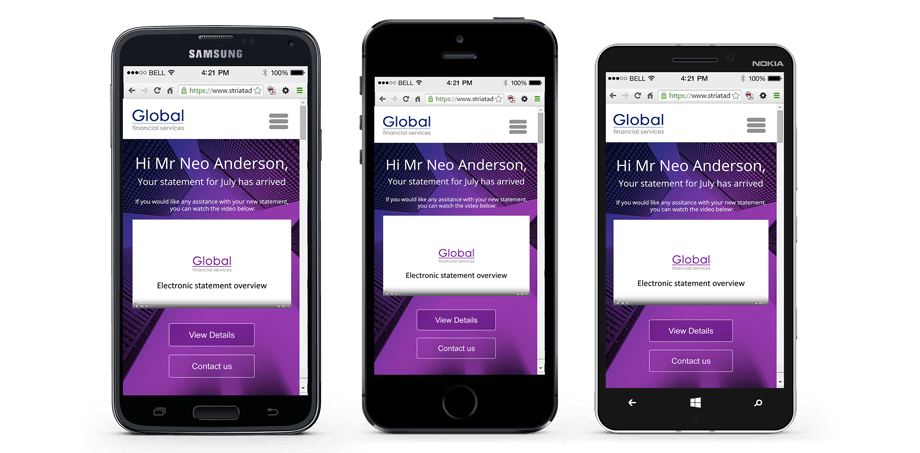
While it’s true that more emails are opened on iPhones than Android devices, there are a lot of Android email users reading your emails and Android has a higher market share of the mobile market, so that number is likely to increase. As a result, templates need to be coded in such a way that the mail renders successfully in as many mobile email clients as possible. Design templates so that the email also renders well across many mobile devices. Be cautious if you’re trying to implement media queries or anchor tags, as they tend to work on some, but not all mobile devices. And remember, the Android smartphone universe is more fragmented, so there are more devices to check and more potential vendor-specific bugs. How do you get it right? Test and test again.
Myth #7: Mobile email preparedness is too costly

Losing customers who may never come back is probably a lot more costly. Updating your email templates so they’re mobile-friendly is an investment in the future. Losing a sale or customer and potentially tarnishing your brand are long-term, costly mistakes. If you’re using your smartphone or tablet to read email and access websites, your clients and prospects are too. Make sure your email is the best it can be all devices, or you may lose their interest and their business.
Your customers have embraced the mobile email revolution – have you?
Striata Communications
Striata Digital Customer Communication
The world’s largest financial services, utility, insurance, retail and telecommunications companies achieve unrivalled results by replacing print and mail with Striata’s interactive electronic documents and transactional messages.
See all our guest posts here and connect with us on the following social channels: