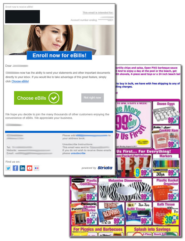
Have you noticed a change in email designs lately? There’s a move toward simplicity – flat design. At the very heart of it, flat design takes away all of the unnecessary items and replaces them with, well… nothing.
Yes, nothing is what we are now being exposed to in the flat design era. Instead of rounded, curved, beveled buttons with inner shadows and outer glows; we are simply presented with a squared off, single colored block with an icon or a text label, or maybe both.
The reason is that a simple design is easier to read and easier for the user to understand how to take action.

Keep it simple – keep it flat
A common design mistake is to over-design particular elements, and have far too many colors on-screen, which results in sensory overload for your recipients. This can easily cause distraction from the main content and core message of your email, creating unnecessary hurdles for your campaign.
Keep It Simple is the perfect phrase for how one should design emails.
Especially if you consider that the email audience is evolving and now consists of many mobile consumers that are on the move. The design needs to be clear and enhance the message.
Flat design forces clean, simple patterns
A short, concise, easy to read story allows your recipients to consume the intended messages as quickly and effectively as possible. And this means: maximized campaign goals.
Want to get the most out of your email design? We can help you… let’s chat
Improve the customer experience with secure document delivery today


